
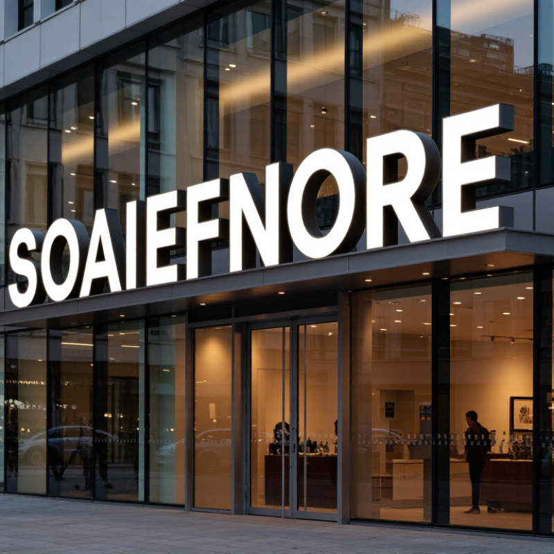
How to Choose Luminous Giant Letters for Your Business
Size, font, color, and lighting style should work as one visual system.
A 2012 national survey of 1,000 U.S. consumers found that 76% had entered a store because of its sign. It also reported that 68% viewed sign quality as an indicator of business quality. These figures show why scale matters. Measure the farthest viewing point, then test the letters outdoors. Six-inch letters may suit a lobby, but they can disappear across a busy street. Consider nearby trees, parked vehicles, and nighttime glare.
Choose a simple font with open counters and clear spacing. Narrow scripts often lose detail when illuminated. High-contrast colors improve recognition, but excessive contrast can feel harsh. Warm white lighting creates a welcoming appearance. Cool white can look cleaner and more technical. Halo lighting adds depth to brick or concrete walls, while face-lit letters deliver stronger direct visibility. My practical experience suggests testing both styles after sunset. Indoor samples can mislead you.
Tips: Photograph the sign from the customer’s approach. Check readability at 50, 100, and 150 feet. Keep the message short. Ask someone unfamiliar with the design to read it quickly. If they hesitate, the font or spacing needs revision. Lighting power also deserves restraint; brighter is not always clearer, especially near reflective glass. Data supports visibility, but local conditions still matter.